

Choosing a Color Palette for Your Home: A Practical Guide
If you’re deciding how to choose a colour palette for your home, start with what’s already fixed: the flooring, built-in carpentry and furniture you plan to keep. A shade that looks calm in an inspiration photo can feel different in your room, where natural light, proportions and existing finishes all affect how it appears.
It’s easy to feel overwhelmed by colour choices, especially when you want a fresh look without replacing everything. A considered palette doesn’t require every room to match. Repeating a few complementary tones can create a sense of flow while leaving room for each space to have its own character.
This guide will help you assess your room’s light, work around permanent finishes and choose a useful mix of main colours and accents. You’ll also learn how to factor in furniture, sofas and custom carpentry, so your choices feel connected from the first sample to the finished room.
Key Takeaways
- To learn how to choose a colour palette for your home, start with the room’s natural and artificial light, as well as finishes you plan to keep.
- Use a dominant base, supporting colours and a few considered accents as a flexible guide, not a strict formula.
- Test colour samples together in the room and observe them at different times before committing.
- Check that new colours work with your furniture and layout. Custom furniture or space planning can help bring the overall scheme together.
How to choose a colour palette for your home: start with the room
A home colour palette is a coordinated group of colours that gives a room a considered feel. It doesn’t mean every surface must match. First decide whether you’re refreshing one room or planning a connected scheme across your home. Then consider the room’s function and its largest furnishings. In a bedroom, for instance, the bed’s footprint affects how much floor space remains, while bedsheets and a duvet bring colour to a prominent part of the room. These choices can influence the palette as much as the walls do.
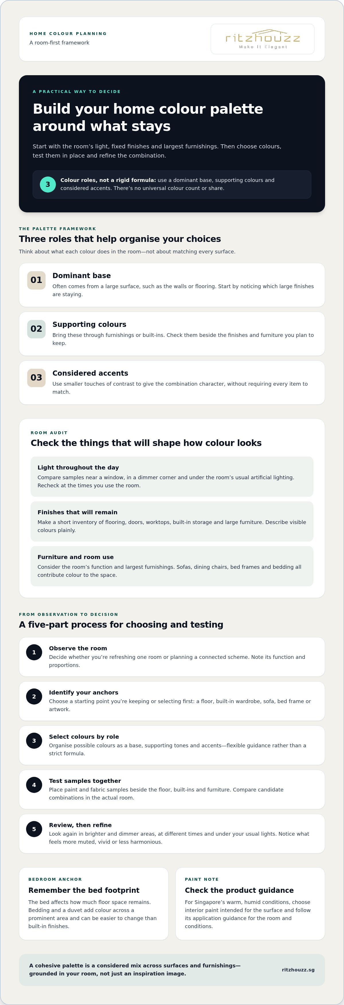
A practical sequence is to observe the room, identify its anchors, select colours, test them in place and refine the combination. This keeps decisions grounded in the items that will stay or be added, rather than in inspiration images with different furnishings or room proportions.
What belongs in a home colour palette?
A palette includes more than wall paint. It brings together colours across surfaces and furnishings, including flooring, built-ins, sofas, dining chairs and bedding. In a bedroom, note the bed frame and the bedding you plan to use. The mattress size affects the bed’s footprint, even though the mattress itself is usually covered. Consider which items will be most visible and which should sit quietly in the background.
A cohesive palette is a considered mix of room colours that work together across surfaces and furnishings without requiring everything to match. There’s no universal formula for how many colours to use or how much of each should appear. The aim is to find a combination that suits the room and how you use it.
Choose a starting point that already exists
Look for an anchor you’re keeping or choosing first. It might be the floor, a built-in wardrobe, a sofa, a bed frame or a meaningful artwork. For a bedroom refresh, bedding can also be a useful starting point because it covers a prominent area and is easier to change than built-in finishes. If you’re selecting a mattress, consider its size in relation to the room and bed frame, then think about how the bedding will contribute to the colours you see each day.
A saved inspiration image can suggest a mood, but it may show different furniture, finishes or proportions from your HDB flat or condominium. Borrow the element you like, such as a calm bedroom or a defined accent, and adapt it to the pieces you own or intend to buy. For whole-home planning, consider how colour, furniture and room use connect across shared spaces. RitzHouzz’s residential interior design and space planning can help bring those choices into a wider room plan.
Read your room’s light and finishes before choosing colours
A colour sample can look noticeably different as the light in a room changes. Before choosing paint, upholstery or other furnishings, observe the space at different times of day. Notice where the room feels brighter, where shadows gather and which surfaces reflect light. Don’t assume a colour seen in a shop or on a screen will look the same at home.
Judge a colour where it will be used, under the light and beside the finishes that will surround it. This makes it easier to assess the room as a whole instead of choosing a shade from an isolated swatch.
How does natural and artificial light change colour?
Daylight and artificial lighting can change how a colour is perceived. The same sample may appear different near a window, in a dimmer corner and after the room’s lights are switched on. The effect depends on the specific space and lighting, so avoid relying on broad rules about which direction a room faces.
To compare colours usefully, look at each sample in brighter and dimmer parts of the room, then check it again under the lighting you normally use. If you spend evenings in the living room, assess the colour then as well as during the day. Note what changes: does the shade seem more muted, more vivid or less harmonious with nearby finishes?
In Singapore’s warm, humid conditions, keep practical material choices in view too. For wall paint, choose a product intended for interior use and follow its application guidance for the room and conditions. A preferred colour still needs to suit the surface it will cover.
Use existing finishes as colour anchors
Make a short inventory of finishes that will remain. Note the visible colours of the flooring, doors, worktops, built-in storage and large furniture. Describe them plainly rather than assigning an undertone you can’t confidently identify. “Light brown flooring” is a useful note; a more specific label is only helpful if the finish clearly supports it.
Then compare candidate colours beside these anchors. Hold paint samples near the floor and built-ins, and place fabric or furniture samples next to any sofa or dining set you plan to keep. A shade that looks appealing alone may feel out of place beside a retained finish. Compare candidates side by side to see which combination feels most settled in the actual room.
This observation stage is especially helpful when deciding how to choose a colour palette for your home without committing to a shade that competes with existing finishes. If you’re planning several connected rooms or coordinating colour with furniture and space planning, discuss your room plan with RitzHouzz as part of your wider interior design decisions.
Build a balanced palette with a simple colour-selection framework
Once you understand the room’s light and fixed finishes, organise your choices by visual role: a dominant base, supporting colours and considered accents. The base may come from a large surface such as the walls or flooring. Supporting colours can appear in furniture or built-ins, while accents add smaller touches of contrast. This framework makes how to choose a colour palette for your home more manageable, but it isn’t a prescribed colour count or a rule about what percentage each shade should occupy.
Instead, ask three practical questions: which colour will set the overall impression, which tones will sit comfortably alongside it, and where could a little contrast add interest? A living room with a neutral wall colour, a deeper-toned sofa and a few accent cushions is one possible arrangement. Other surfaces and furnishings can take on these roles depending on what the room needs.
Should you choose a tonal, analogous or contrasting palette?
A tonal palette uses variations within a related colour family for a quiet, layered effect. An analogous palette combines neighbouring colours on a conventional colour wheel, offering more variety while maintaining a sense of connection. A contrasting palette puts more distinct colours together to create emphasis. None is automatically better. Choose the approach that suits the room’s character and the finishes you’re keeping.
| Approach | General mood | Practical trade-off |
|---|---|---|
| Tonal | Restrained and cohesive | Subtle variation can feel understated if you want a stronger focal point. |
| Analogous | Connected, with more colour variation | Neighbouring hues still need to work with the room’s fixed finishes. |
| Contrasting | More defined and expressive | Strong differences can draw attention, so consider where each colour appears. |
Think of contrast as a deliberate choice, not a requirement. If a room already has noticeable flooring or furniture, a restrained tonal or analogous direction may be enough. If the main surfaces feel quiet, a carefully placed contrasting accent can create a focal point without making every element compete.
Coordinate walls, furniture and accents
Decide which large surfaces and furnishings will carry the most visual weight before choosing smaller details. In a compact HDB living room, for instance, the wall colour, built-in storage and sofa may occupy much of the view, so their relationship deserves attention first. Smaller furnishings and accessories can then introduce an accent without asking every surface to make a statement.
If a sofa is part of your plan, compare its intended colour with the walls and nearby finishes before settling on either. Browse the RitzHouzz sofa collection with the room’s palette in mind, rather than treating furniture as an unrelated final choice. The best framework is one that helps the room feel considered while leaving enough variation for it to remain welcoming.
Test your colour palette before committing to the whole room
A shortlist is a starting point, not a final decision. Colours interact with one another and with the finishes around them, so assess your candidates as a group before painting a full wall or selecting major furnishings. A small sample helps you compare options, but it can’t guarantee the final appearance across a larger surface.
This matters whether you’re refreshing an HDB flat, planning a BTO interior, updating a resale flat or furnishing a condominium. Layouts, window placement, existing finishes and lighting vary from room to room. Use a repeatable process in your own space instead of relying on someone else’s finished-room example.
A practical sample-testing sequence
Keep the test focused. Shortlist a few possible colours, then place samples where they’ll need to work: near the flooring, built-ins, retained furniture or other finishes. View more than one candidate together so you can judge their relationship, not just whether each shade looks appealing on its own.
Observe the samples in the room’s usual daylight and artificial lighting. Note which combinations seem balanced and which feel too strong, dull or disconnected. Compare the most promising options again before deciding what to keep or remove.
- Shortlist: Choose candidates that suit the room’s intended mood and existing finishes.
- Place: Position samples beside the materials and furnishings they must coordinate with.
- Observe: Check them in brighter and dimmer areas, and under the lighting you normally use.
- Compare: Look at the colours together, then note the combinations that feel most cohesive.
- Revise: Remove or adjust a candidate if it competes with a finish you’re keeping.
What if the palette feels too bold or too flat?
If the room feels visually busy, reduce competing accents before changing the main colours. If the scheme seems flat, try one more defined accent in a limited area. Then review the result beside the room’s fixed finishes so you can see whether the adjustment brings the mix back into balance.
Think of samples as a way to make a more informed choice, not as a perfect preview. A small patch may not show exactly how a colour will read across a large surface, and surrounding finishes can influence the overall impression. If you’re testing paint, follow the product’s instructions for sampling and application. If furniture is part of the plan, consider its scale and colour alongside the walls rather than treating it as a separate decision.
Working through these checks is a practical part of how to choose a colour palette for your home with greater confidence. If you’re coordinating colours with furniture or a wider room plan, share your requirements with RitzHouzz to discuss interior design and furniture options.
Bring your home colour palette together through furniture and design
A palette feels complete when it works with the pieces that make a room useful, not just with its walls. Before choosing new furniture, compare its colour and visual scale with the room’s flooring, built-ins and planned finishes. A large sofa in a compact living room, for example, may become a strong visual feature even in a restrained colour. Placement matters too: a piece beside a contrasting wall can feel more prominent than the same piece against a similar tone.
If you’re keeping existing furniture, include it in the colour decision rather than treating it as a detail to solve later. For new furniture, consider its intended position and how much of it will be visible from adjoining spaces. This is particularly helpful in HDB flats and condominiums, where an open living and dining area may call for continuity without making both zones identical.
Make furniture part of the palette, not an afterthought
Look at furniture colour, shape and placement together. A visually substantial piece may carry enough colour on its own, while a smaller or more understated item can leave room for a stronger accent elsewhere. Keep the balance practical: walkways and everyday use matter as much as how the colours appear in a plan. For advice on how sofa position contributes to room harmony, refer to the existing luxury sofa interior design article.
Before discussing furniture choices, gather the room’s measurements and a few clear photographs. Include the walls, flooring and pieces you plan to retain. These details make the conversation specific to your room rather than an abstract discussion of colour preferences.
When can design guidance help?
Design guidance can be useful when your choices need to work across connected rooms, fit a particular layout or coordinate with built-in storage. Space planning considers room function and furniture placement alongside the palette, so colours support how the space is used. RitzHouzz provides interior design consultancy and space planning for homes.
Custom furniture may also suit requirements for tailored dimensions or a particular design direction. Rather than choosing a colour in isolation, consider how the furniture will sit with the walls, floor finishes and other large elements in the room. This can be useful when standard furniture proportions make a compact space feel crowded or leave the layout unresolved.
Bring together your preferred colours, room measurements and furniture requirements, then refine the plan around the way you live. To discuss your home and furniture requirements, contact RitzHouzz.
Turn your colour decisions into a considered room plan
A palette can guide more than your next paint choice. Let it shape the furniture decisions you make over time, so each new piece feels considered alongside the room’s existing character. Before your next update, decide what you want the space to feel like and which furniture choice would best support that direction. You don’t need to resolve every detail at once.
Knowing how to choose a colour palette for your home is about making choices that feel right in your own rooms, not following a fixed formula. If you’re ready to bring your colours and furniture plans together, talk with RitzHouzz about your palette and furniture plans.
Frequently Asked Questions
How many colours should a home colour palette have?
There’s no fixed number. Choose enough colours to give the room interest and definition, but avoid assigning a new colour to every item. List the colours already present in permanent finishes and large furnishings, then ask whether another shade serves a purpose, such as defining a focal point or linking two areas. If it doesn’t, leave it out.
Should the same colour palette be used throughout the whole home?
No. A bedroom can feel more personal than a shared living area, and rooms separated by doors don’t need identical schemes. Decide how much connection you want between spaces based on how your household uses them. For open-plan areas, consider the rooms as zones within one larger space. For enclosed rooms, choose a distinct direction that suits each room’s use.
Can dark colours work in a small HDB or condominium room?
Yes. Dark colours can work in a small room, particularly if you want a more defined or intimate character. Think about the room’s purpose and where you want attention to fall. A study nook, for example, might use a deeper tone to distinguish it from a neighbouring area. Keep the room’s furnishings and storage needs in mind so the colour choice supports everyday use.
How do I choose wall colours to match existing flooring?
Consider the floor’s overall pattern as well as its main colour. Strongly patterned tiles or varied wood grain may already provide visual detail, so a quieter wall colour can help the room feel composed. If the flooring is plain, the walls have more room to contribute character. Also consider how much of the floor will remain visible once the room is furnished, rather than judging the finish in an empty room.
Should furniture or wall colour be chosen first?
If both are new, start with the decision that has the greatest effect on the room’s character or layout. A statement sofa or dining set may set the direction for the surrounding colours. In another room, a particular wall treatment may be the central design choice. Decide which element matters most, then make the remaining selections support it rather than compete for attention.
How can I tell whether a paint colour will look different in my room?
Beyond lighting, the paint finish and wall surface can affect how a colour appears. A textured wall may look different from a smooth one, and sheen can change how a surface reflects light. Check the paint maker’s finish options and consider the condition of the wall you plan to paint. A colour shown on a screen may also differ from the actual paint, so use it as inspiration rather than a precise match.
Can I combine warm and cool colours in one room?
Yes. Give the mix a clear hierarchy so the room doesn’t feel divided between competing directions. You might let one temperature lead across the larger elements, then introduce the other through a smaller detail, such as a patterned cushion or artwork. Consider the room’s materials too, since wood, stone and fabric contribute their own visual character. The aim is a deliberate contrast, not an exact match.
Disclaimer
The information in this article is provided for general guidance only and is intended to help readers make informed decisions about mattresses, furniture, renovation, carpentry and related home solutions. Product specifications, prices, promotions, availability, warranties and services may change without notice. Actual colours, materials, dimensions and comfort may vary from images or descriptions. For renovation, carpentry or space-planning projects, final recommendations, measurements, scope of work and quotations should be confirmed directly with RitzHouzz before proceeding. Mattress comfort and suitability are subjective, and any health-related information is general in nature and should not be treated as medical advice. Please contact RitzHouzz or visit our showroom for the latest product and service information.